
| 일 | 월 | 화 | 수 | 목 | 금 | 토 |
|---|---|---|---|---|---|---|
| 1 | 2 | 3 | 4 | 5 | ||
| 6 | 7 | 8 | 9 | 10 | 11 | 12 |
| 13 | 14 | 15 | 16 | 17 | 18 | 19 |
| 20 | 21 | 22 | 23 | 24 | 25 | 26 |
| 27 | 28 | 29 | 30 |
- 범주형 변수 처리
- 서포터즈 촬영
- Brightics AI
- Brightics 서포터즈
- Python
- 브라이틱스 스태킹
- Brigthics Studio
- 데이터 분석 플랫폼
- pymysql
- 삼성 SDS
- paper review
- 검증 평가 지표
- Activation Function
- 딥러닝
- 브라이틱스 AI
- 삼성 SDS 서포터즈
- 비전공자를 위한 데이터 분석
- 파이썬 내장 그래프
- michigan university deep learning for computer vision
- Random Forest
- 브라이틱스 서포터즈
- 데이터 분석
- 머신러닝
- Brightics studio
- Brightics EDA
- 파이썬 SQL 연동
- 분석 툴
- 브라이틱스 분석
- 브라이틱스 프로젝트
- Deep Learning for Computer Vision
- Today
- Total
하마가 분석하마
[python] 내장 그래프 2 (boxplot, barplot) 본문
boxplot, barplot
데이터 불러오기
import pandas as pd
import matplotlib.pyplot as plt
pd.set_option('display.max_rows', 80)
pd.set_option('display.max_columns', 999999)
plt.style.use('ggplot')
## 상자그림
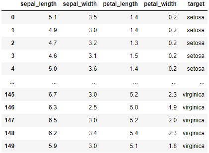
from sklearn.datasets import load_iris # iris 데이터 제공 라이브러리
iris = load_iris()
iris_df = pd.DataFrame(data=iris.data, columns=iris.feature_names)
iris_df['target'] = iris.target
iris_df['target'] = iris_df['target'].map({0:"setosa", 1:"versicolor", 2:"virginica"})
iris_df.columns = ['sepal_length','sepal_width','petal_length', 'petal_width','target']
iris_df
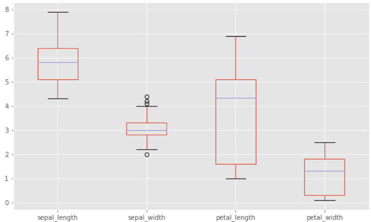
상자 그림 (boxplot)
- 데이터프레임_객체.plot(kind='box', figsize(n,m))
모든 변수에 대해서 상자 그림을 보고 싶을 때, 데이터프레임에 바로 plot() 메소드를 적요하면 된다.
iris_df.plot(kind='box', figsize = (10,8))
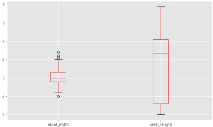
원하는 변수만 상자그림을 통해서 확인하고 싶다면 해당 변수 뒤에만 .plot()을 적용하면 된다.
iris_df[['sepal_width','petal_length']].plot(kind='box', figsize = (10,6))
막대그래프
- 데이터프레임_객체.plot(kind='bar', rot=k, figsize=(n,m))
- 데이터프레임_객체.plot.bar()
연속형 변수와 범주형 변수가 모두 들어있는 데이터에서 막대그래프를 통해 수치를 확인하기 위해서는 그룹화를 한 뒤 그려야 한다. 데이터프레임 객체에 바로 plot() 메소드를 적용하면 원하는 결과가 나오지 않을 수 있다.
데이터 프레임에다가 바로 plot.bar()를 적용하면 인덱스 별로 변수의 수치를 보여준다.
iris_df.plot(kind='bar', rot=0, figsize = (12,6))
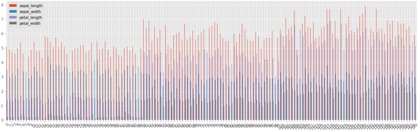
이와 같이 인덱스 별로 4개 변수에 대한 수치가 나온다.
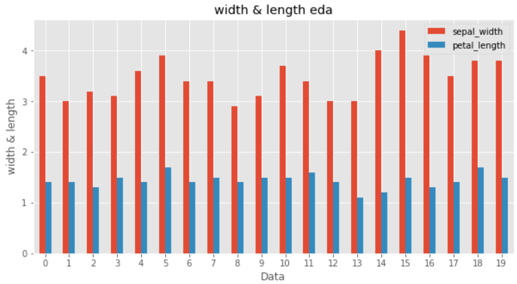
맨 처음 20개의 sepal_width, petal_length 보기
iris_df[["sepal_width","petal_length"]][:20].plot(kind='bar', rot=0, figsize=(10,5))
plt.title("width & length eda")
plt.xlabel("Data")
plt.ylabel("width & length")
plt.show()
iris_df[['sepal_length', 'sepal_width', 'petal_length', 'petal_width']][:20].plot.bar(rot=0, figsize=(10,5))
plt.title("Iris Bar Plot")
plt.xlabel("Data")
plt.ylabel("Feature")
plt.ylim(0, 7)
plt.show()
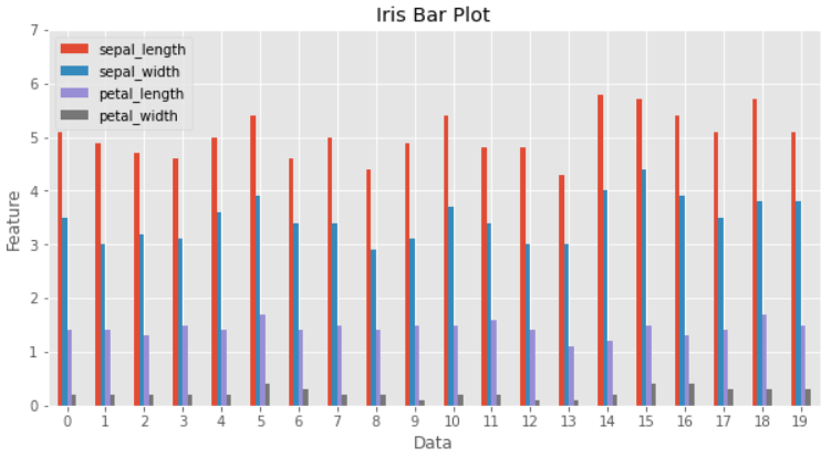
.plot.bar()도 똑같은 결과를 도출
iris_df에 ID 변수를 추가한 뒤, .plot.bar()에서 x축을 지정하는 방법을 살펴보자.
이후 target 꽃의 종류 별로 연속형 변수인 예측 변수들이 어떤 차이가 있는지 확인해보자.
## 기존의 인덱스를 사용하여 ID 변수 임의로 생성
iris_df = iris_df.reset_index().rename(columns = {'index':'ID'})
iris_df.ID = iris_df.ID+100
iris_df.head()
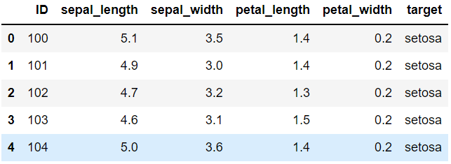
x축에 ID를 두고 y축에 원하는 변수만 넣어서 20개의 관측치의 특징을 살펴보자
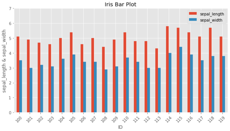
iris_df[:20].plot.bar(x = 'ID', y =['sepal_length','sepal_width'] ,rot=45, figsize=(10,5))
plt.title("Iris Bar Plot")
plt.xlabel("ID")
plt.ylabel("sepal_length & sepal_width")
plt.ylim(0, 7)
plt.show()
막대그래프 2 (그룹화 이후 그리기)
결과 변수는 3개의 범주를 가지고 있다.
각 수준 별로 연속형 변수들의 (length와 width) 평균 혹은 중앙값, 분산 등의 차이를 확인하고 싶다면 그룹별 축약한 데이터 프레임을 사용해서 그래프를 그려야 한다.
타겟별 연속형 변수들의 평균
## ID는 제외
iris_df.loc[:,"sepal_length":].groupby('target').mean()
df1 = iris_df.loc[:,"sepal_length":].groupby('target').mean()
df1.head()
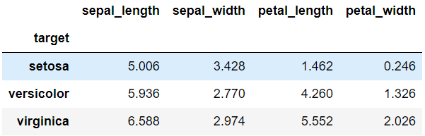
target 별로 연속형 변수들의 평균 확인
index는 setosa, versicolor, virginica가 되고 변수는 총 4개가 된다.
groupby()의 agg를 바꾸면 평균 말고 다른 함수를 적용할 수 있다.
## ID는 제외
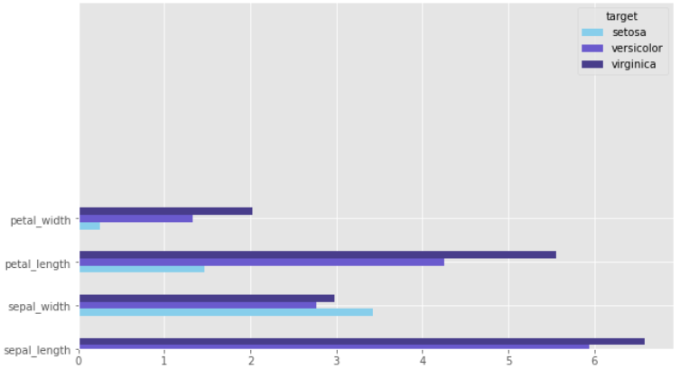
iris_df.loc[:,"sepal_length":].groupby('target').mean().T
df2 = iris_df.loc[:,"sepal_length":].groupby('target').mean().T
df2.head()
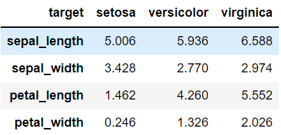
이전의 groupy의 행과 열을 바꾼 것
index는 sepal_length, sepal_width, petal_length, petal_width가 되고 변수는 총 3개가 된다.
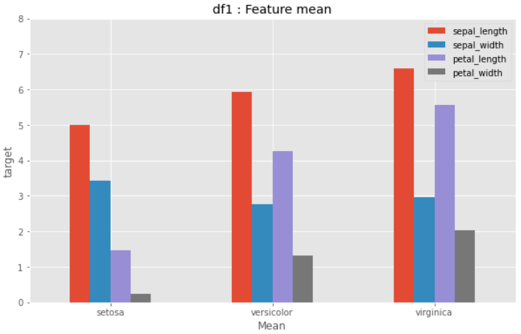
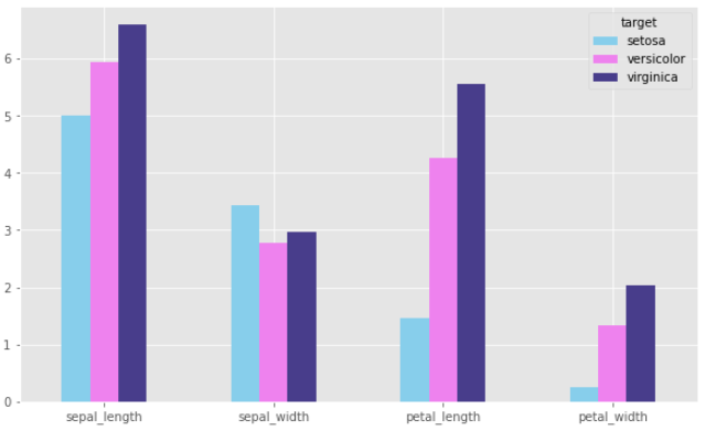
## 그룹분석 결과 시각화 : df1
df1.plot.bar(rot=0, figsize=(10,6))
plt.title("df1 : Feature mean")
plt.xlabel("Mean")
plt.ylabel("target")
plt.ylim(0, 8)
plt.show()
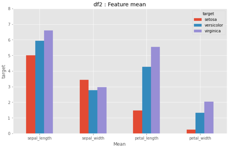
df2 시각화
## 그룹분석 결과 시각화 : df2
df2.plot.bar(rot=0, figsize=(10,6))
plt.title("df2 : Feature mean")
plt.xlabel("Mean")
plt.ylabel("target")
plt.ylim(0, 8)
plt.show()
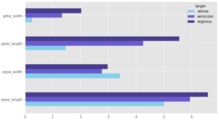
color 추가하기
## color를 사용하여 색 입히기
df2.plot.bar(rot=0, figsize=(10,6), color=['skyblue','violet', 'darkslateblue'])
plt.show()
추가적으로 상자 그림의 축을 y로 두려면 kind = 'barh'로 하면 된다.
barh를 통해 가로로 그리기
kind = 'barh' 옵션을 넣으면 y축이 기준이 되도록 그림을 그릴 수 있다.
이 경우에 유의해야 할 점을 알아보자.
## df2 가로로 그리기
df2.plot(kind = 'barh', rot=0, figsize=(10,6), color=['skyblue','slateblue', 'darkslateblue'])
plt.ylim(0, 8)
plt.show()
위의 절반 정도가 비어있는 것이 보인다.
이는 plt.ylim(0,8)으로 y축의 범위를 8칸으로 정하였기 때문이다.
y축에 들어갈 변수가 4개가 있는데 칸은 8개이다 보니 이상하게 그려지는 것이다.
## df2 가로로 그리기
df2.plot(kind = 'barh', rot=0, figsize=(10,6), color=['skyblue','slateblue', 'darkslateblue'])
plt.show()
plt.ylim()을 제거해주면 제대로 그릴 수 있다.
'python' 카테고리의 다른 글
| [python] pymysql을 사용한 sql 연동1 (0) | 2021.12.23 |
|---|---|
| [python] 내장 그래프 3 (histogram, kernel density, pie) (0) | 2021.07.29 |
| [python] 내장 그래프 1 (line, scatter) (0) | 2021.07.22 |
| [python] Numpy method (0) | 2021.07.07 |
| [python] 문자열 포맷팅 (0) | 2021.07.01 |


